An INTRADESIGN project in collaboration with SEVY PEREZ
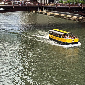
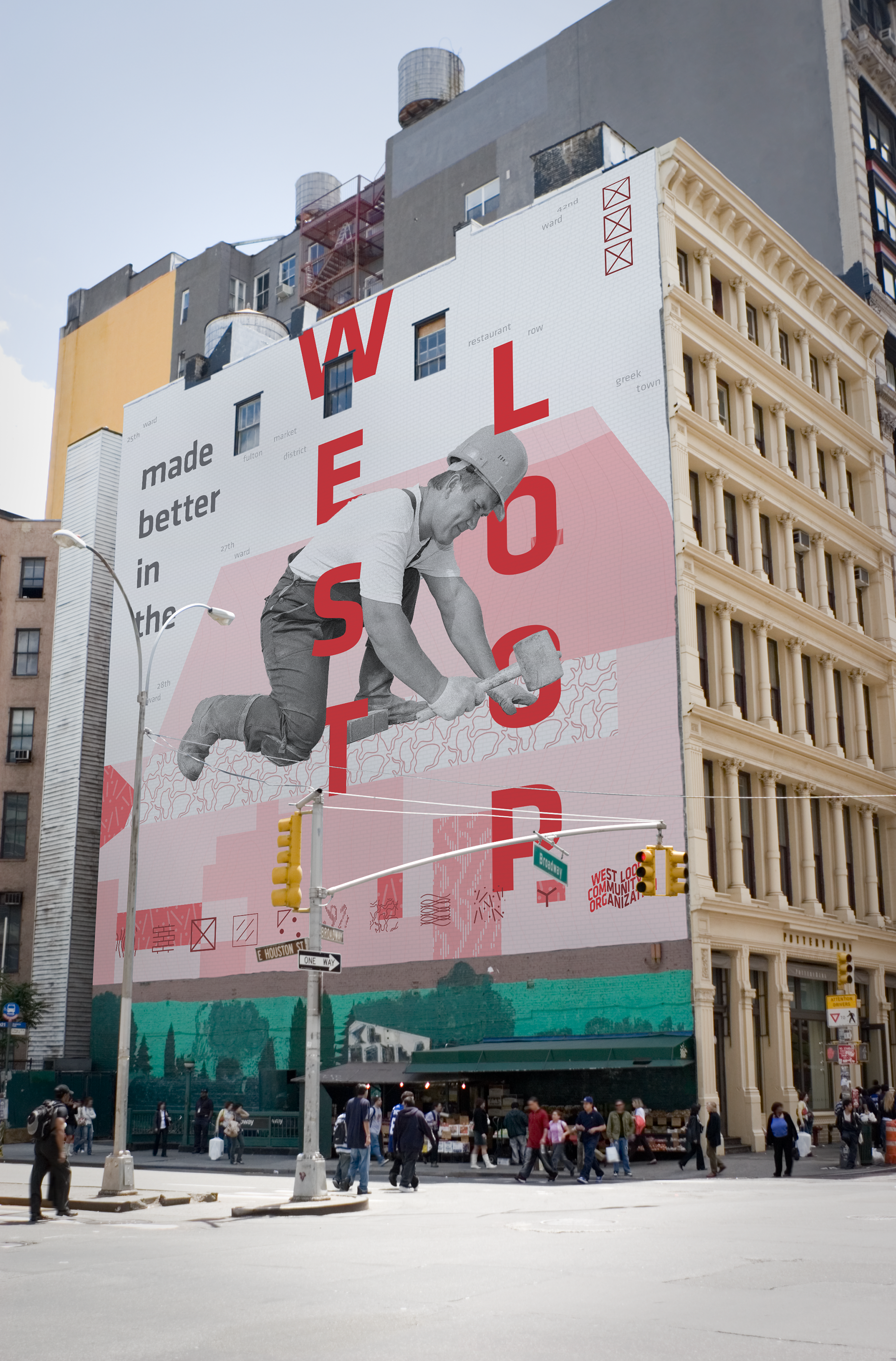
Taking its name from its geographical position across the Chicago River from the concrete-steel-and-glass jungle of The Loop, the West Loop is one of the fastest growing neighborhoods in Chicago. The neighborhood is ripe with vibrant residents, booming development, and rich history. Formed in 1991, the West Loop Community Organization is a recognized delegate agency for the City of Chicago and a membership organization that represents the business and residential communities within the West Loop.
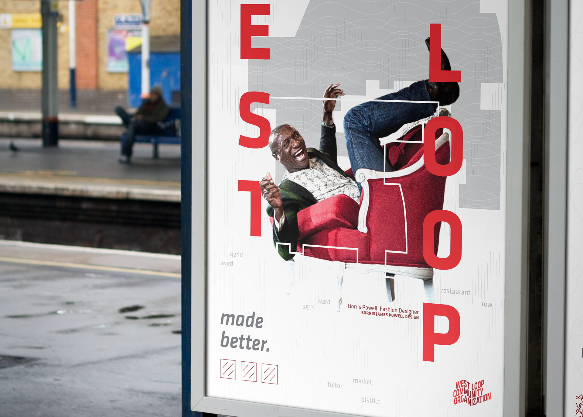
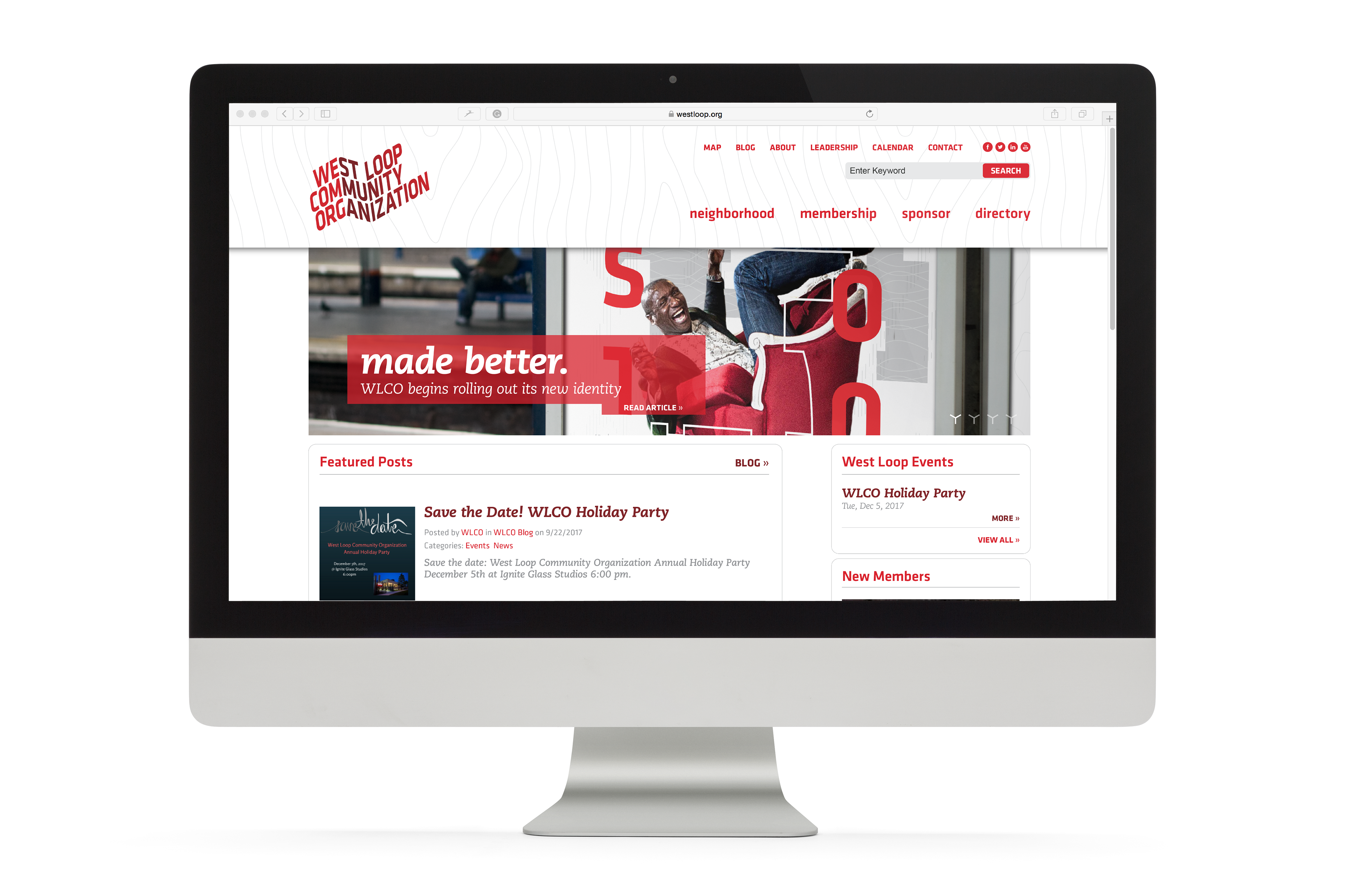
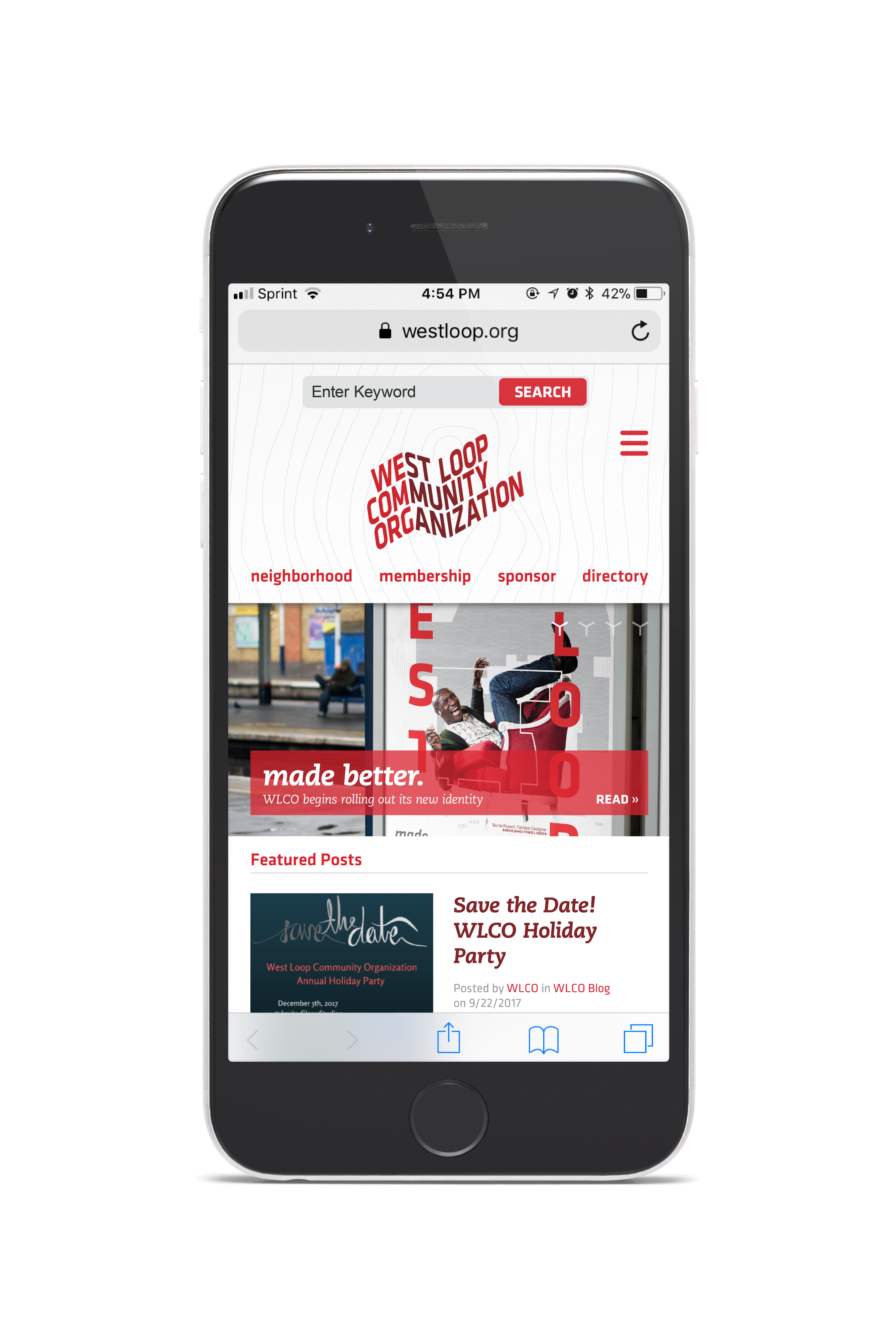
Working with Intradesign, the task was to develop an identity system that remained sensitive and true to the neighborhood and its delegating organization, distinguish the West Loop as a unique and premium area of the city, and—perhaps most importantly—put people at the forefront of the rebranding proposal.
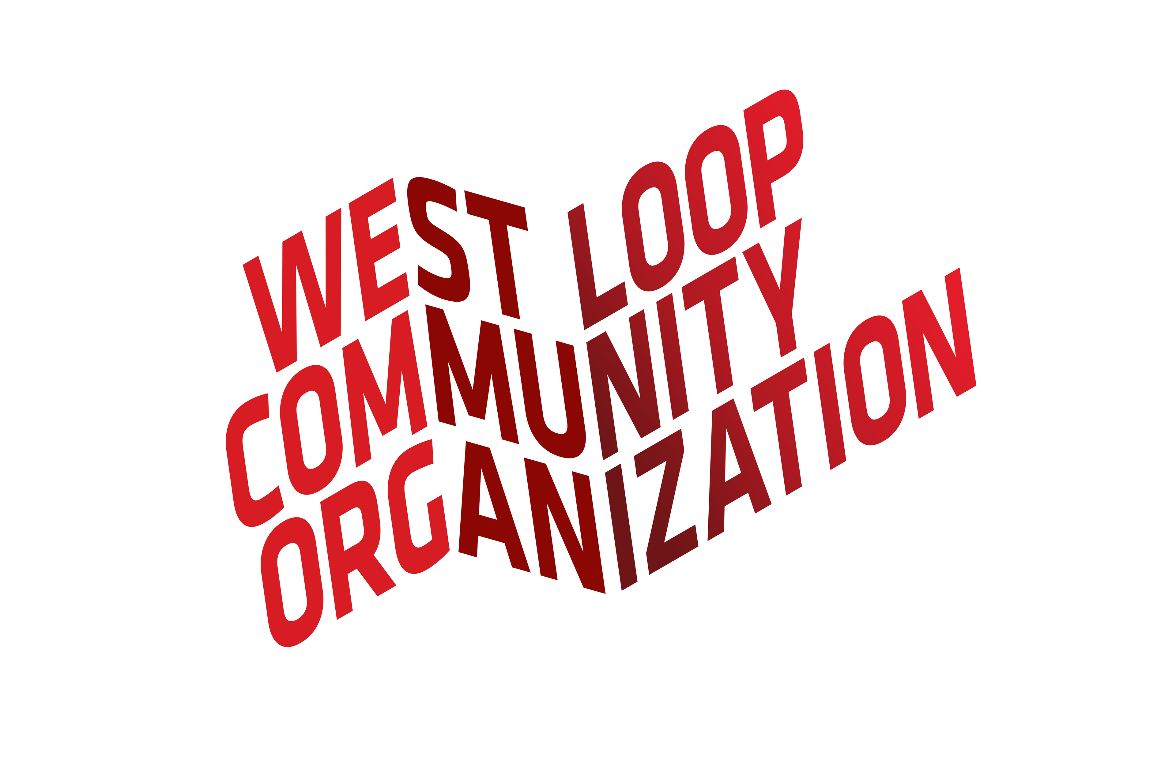
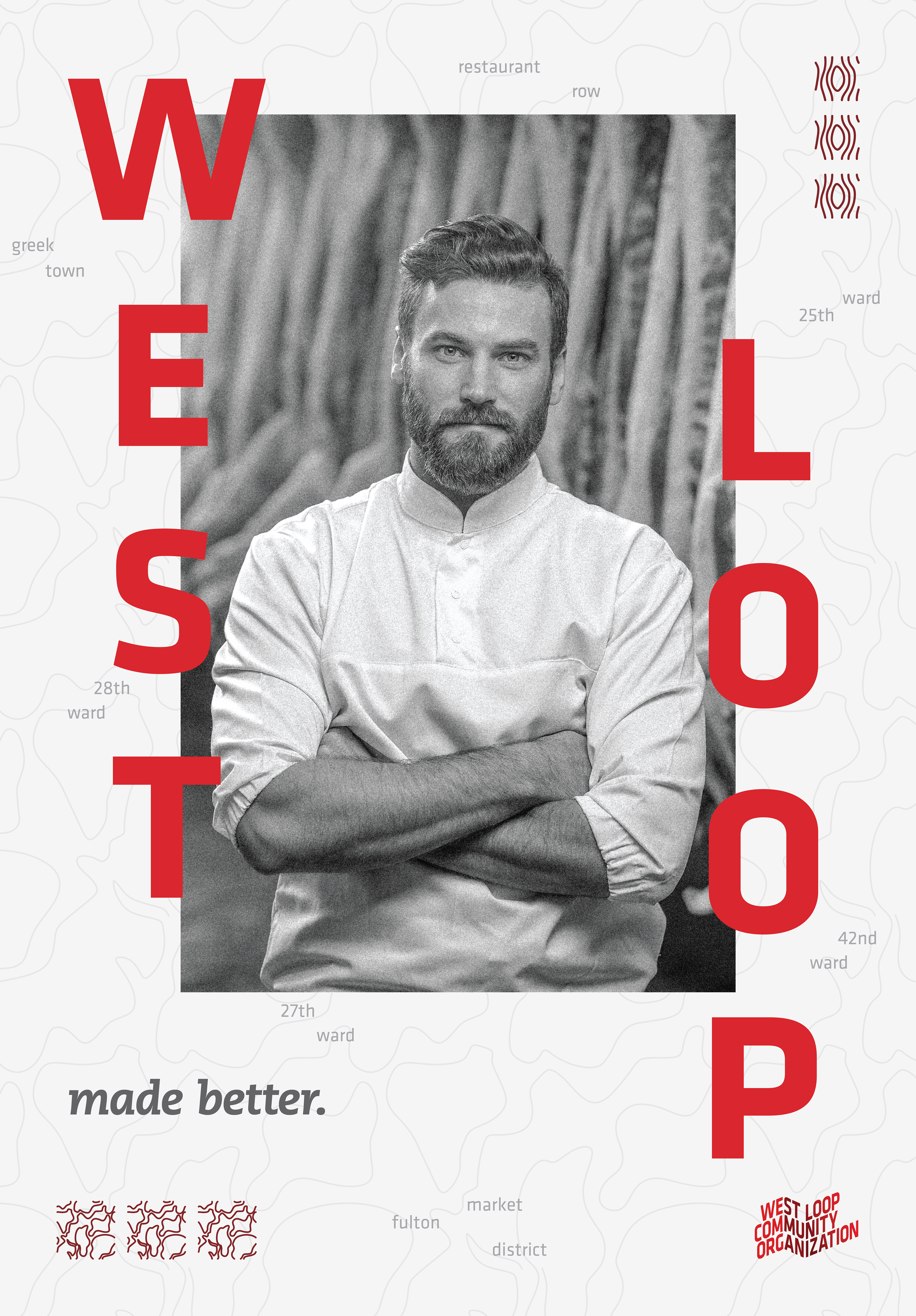
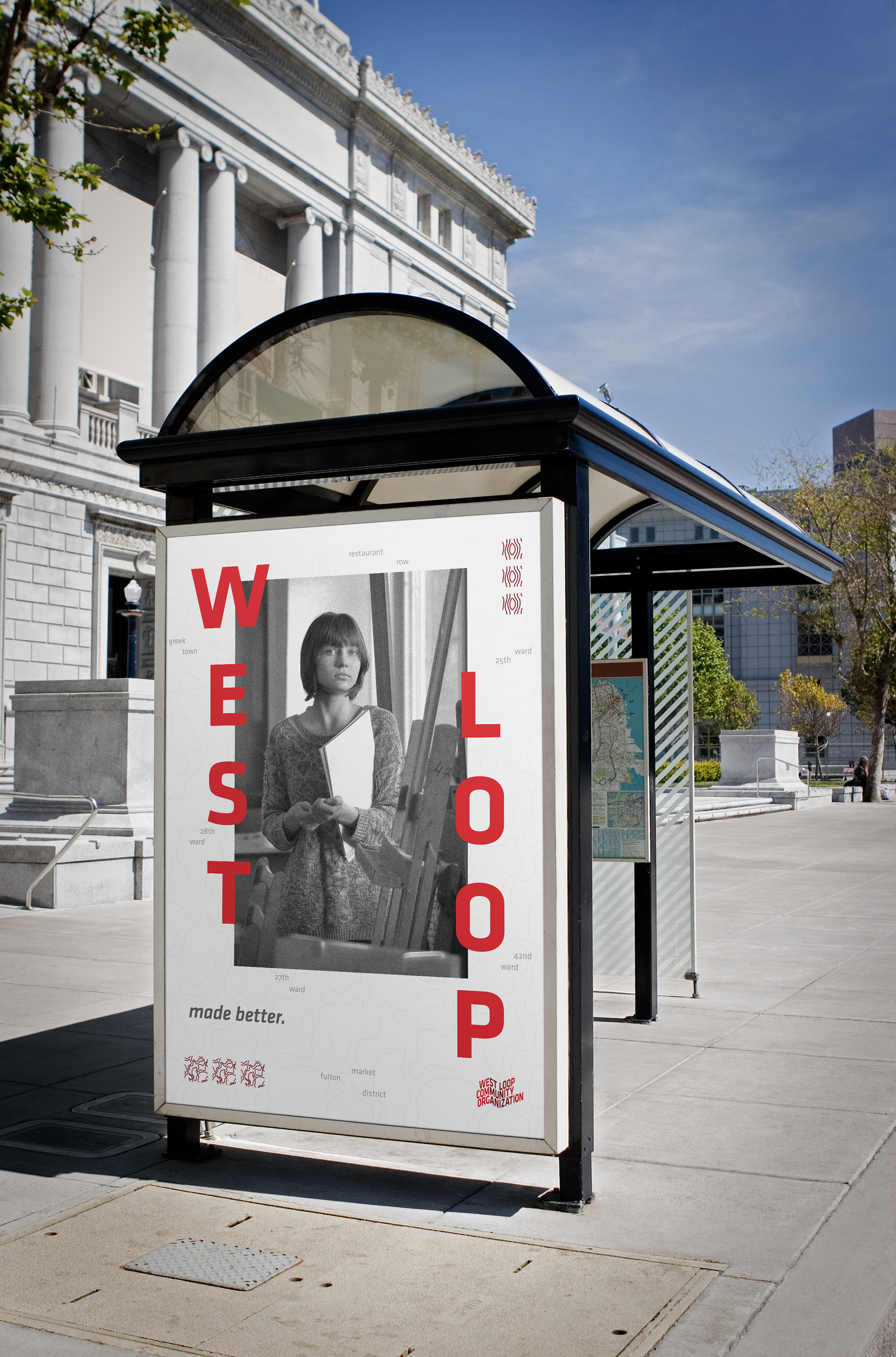
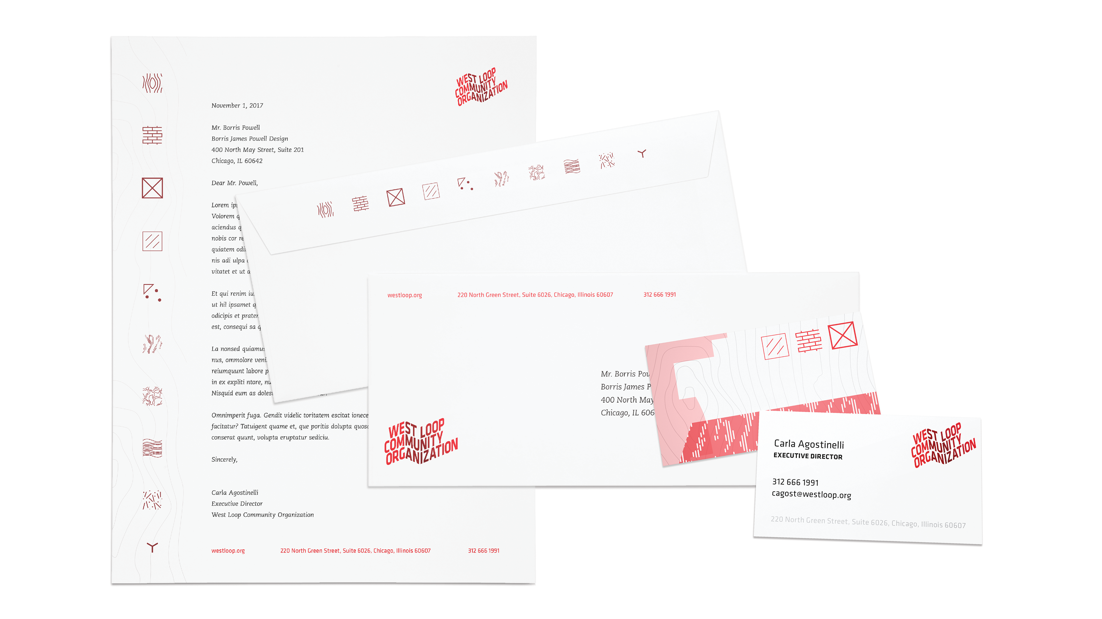
Together with the logotype, typographic palette, and color palette developed by Sevy Perez, WLCO’s new brand identity becomes an information system, capable of communicating referential meaning while remaining interpretable, cohesive, one-of-a-kind, and true to the diverse identity of the West Loop.
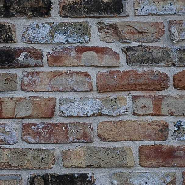
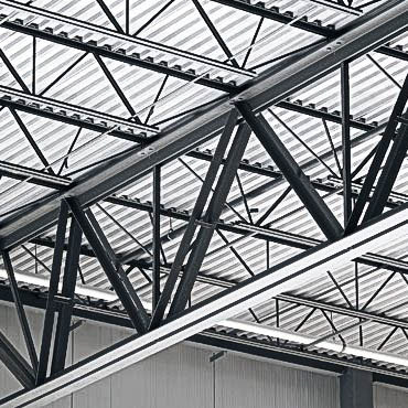
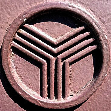
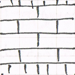
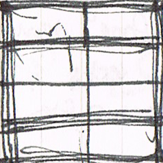
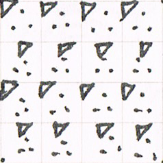
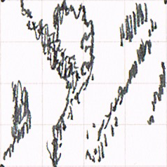
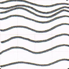
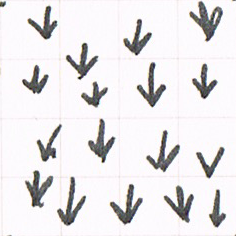
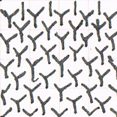
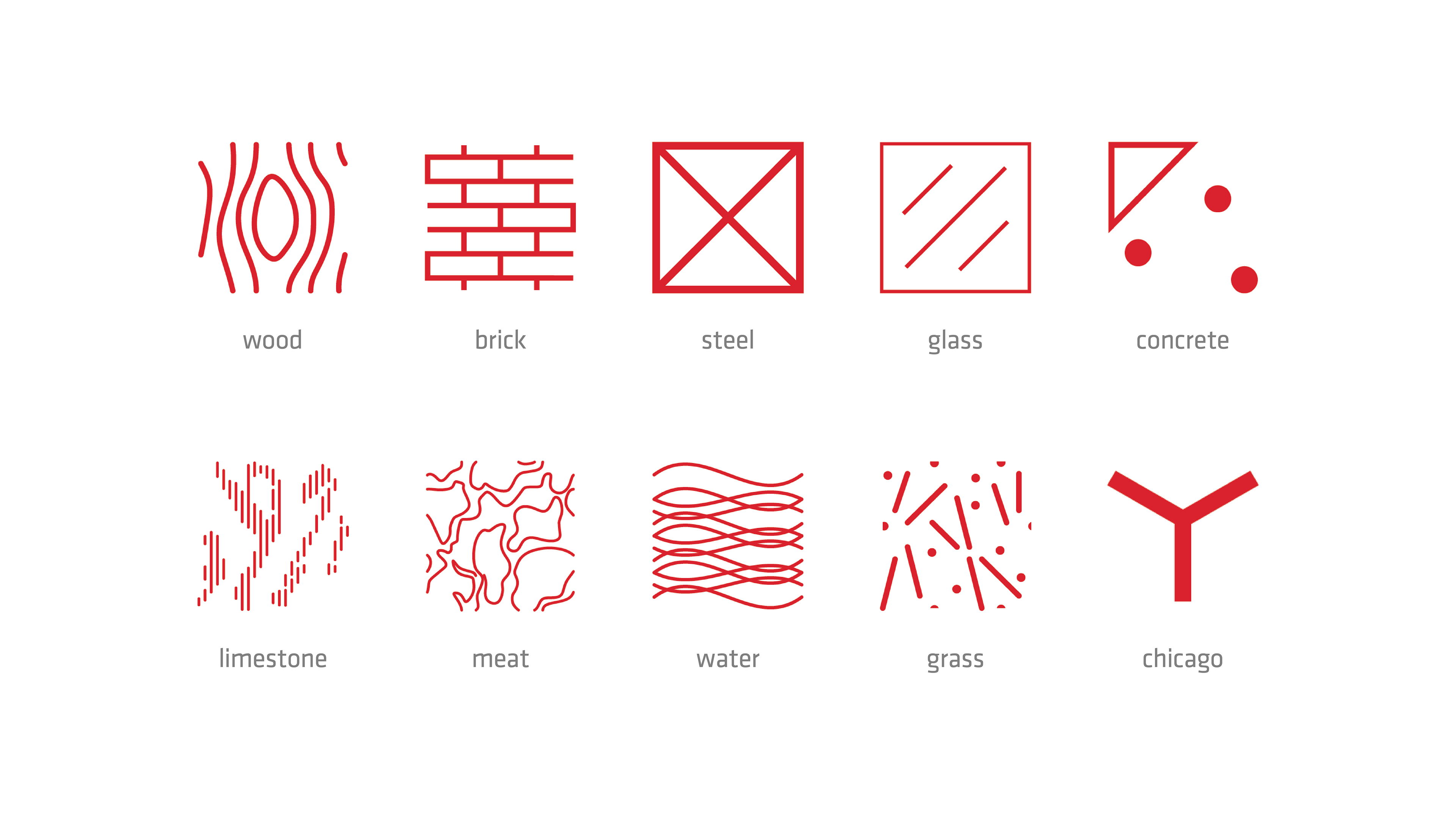
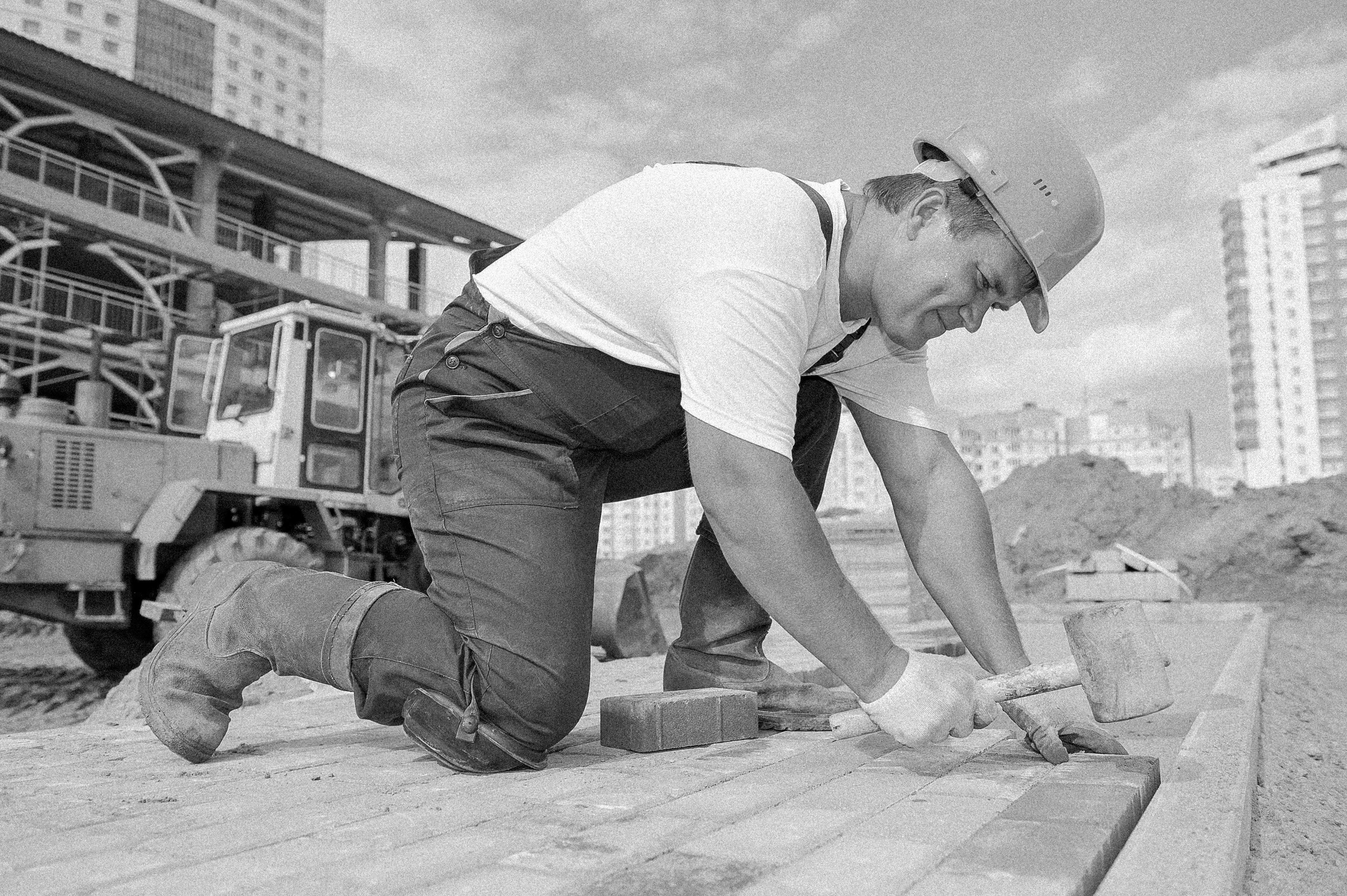
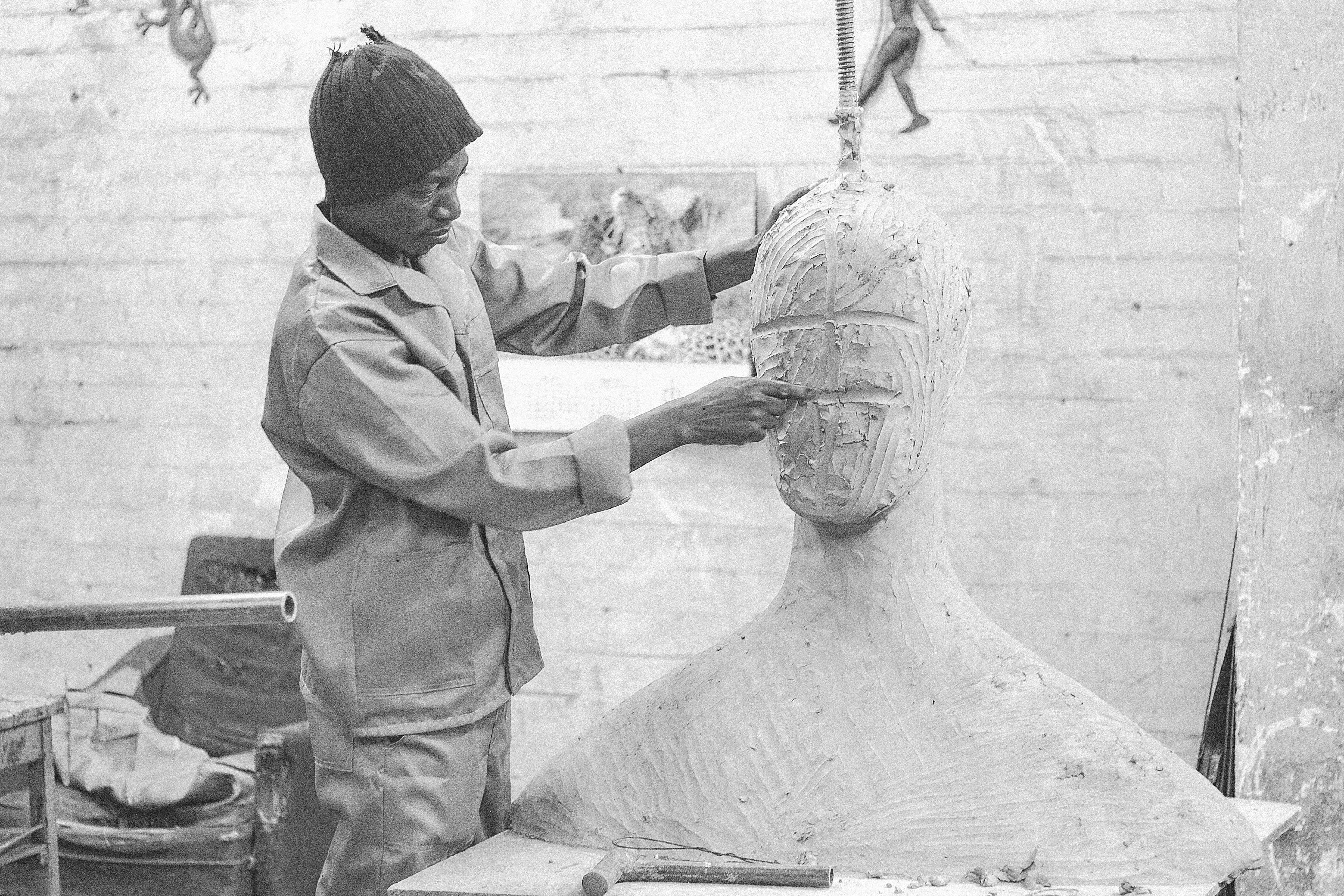
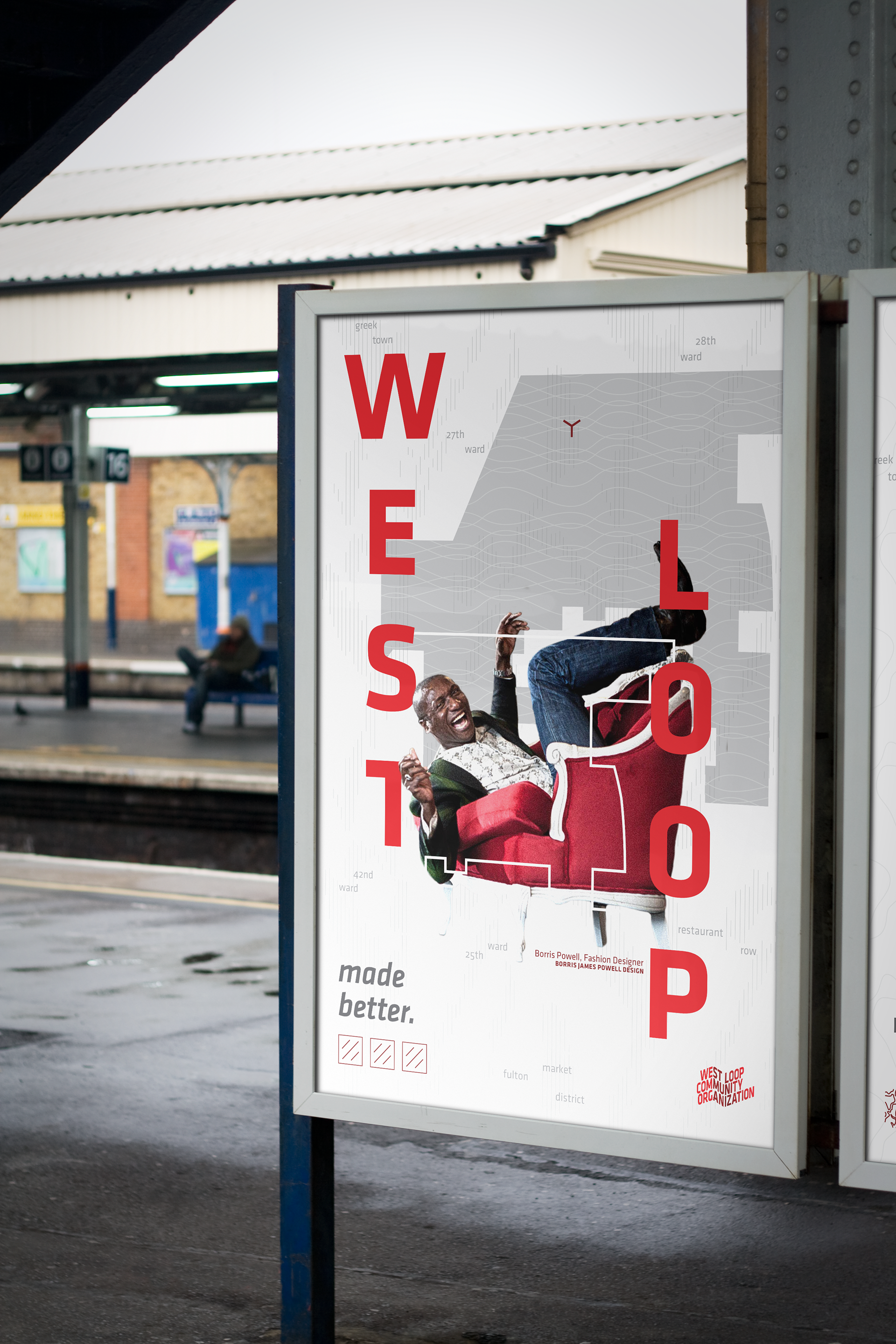
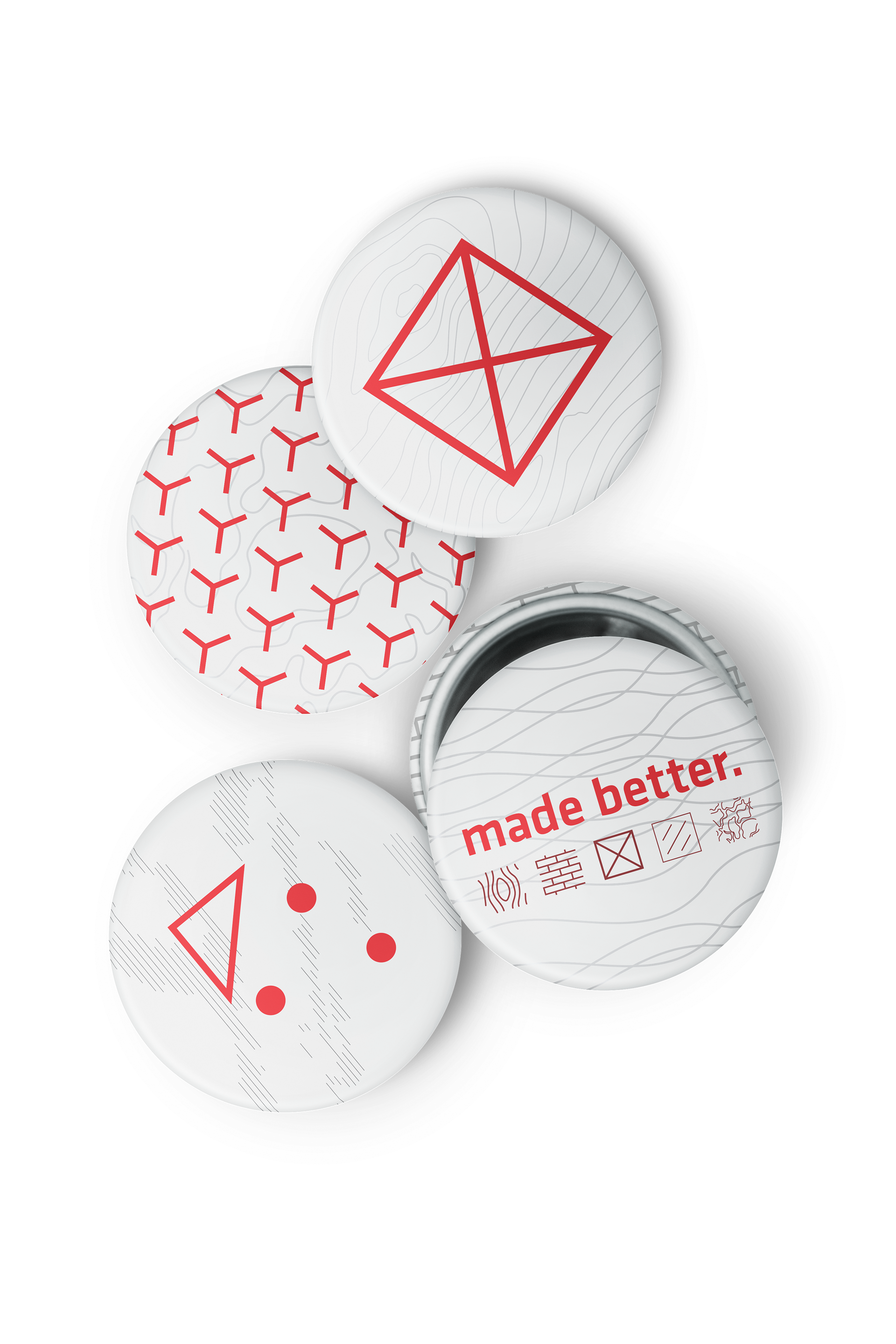
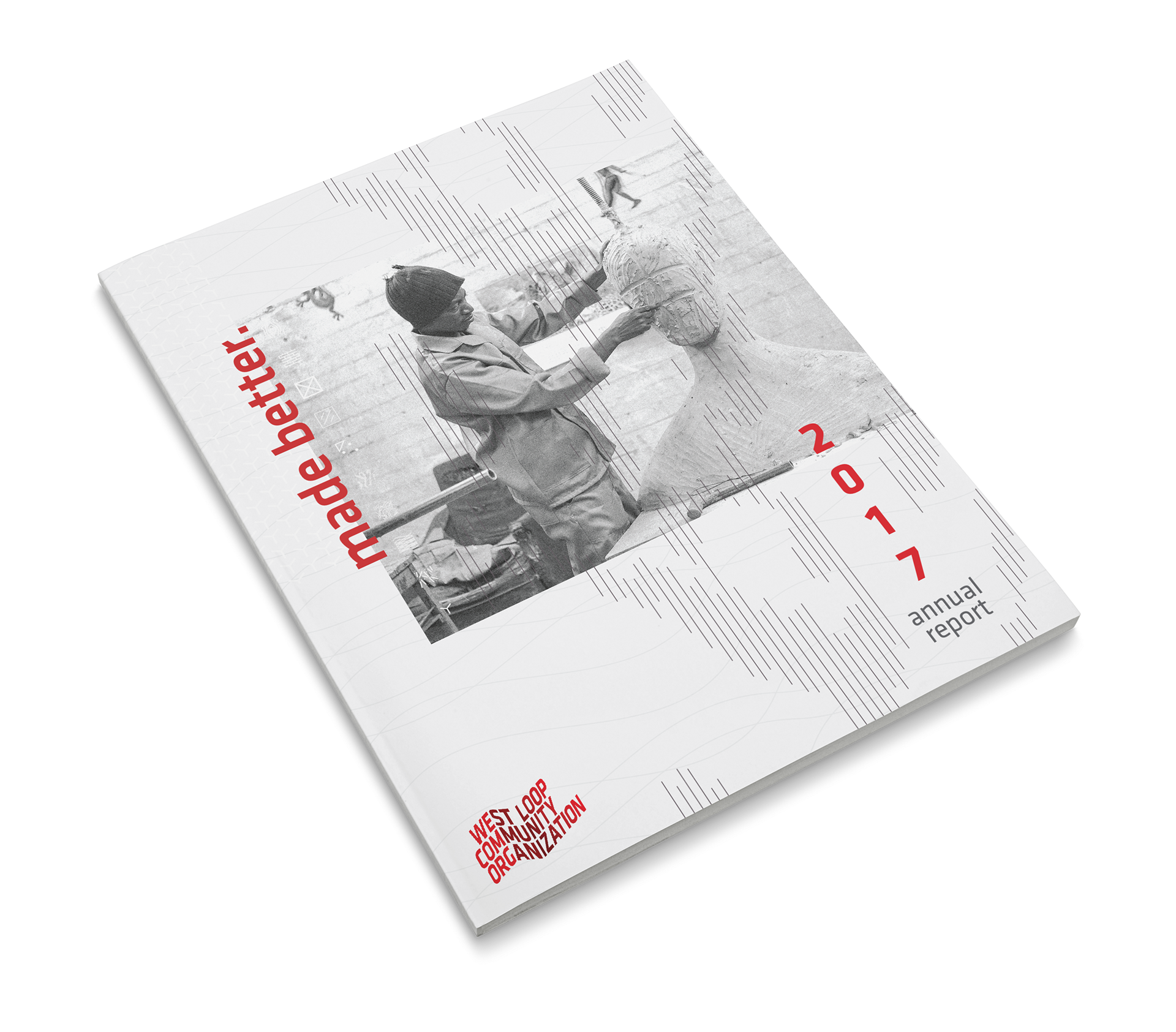
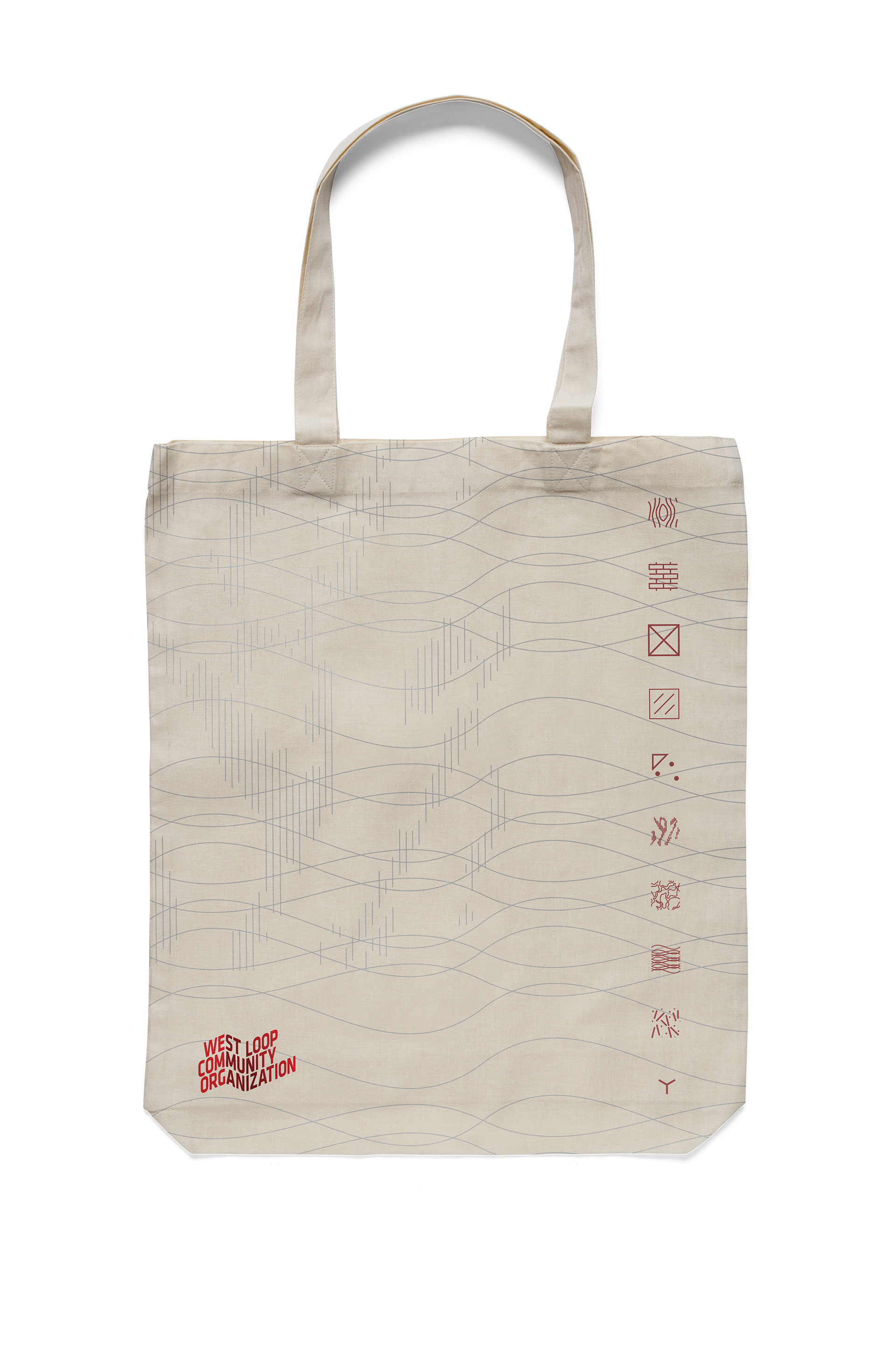
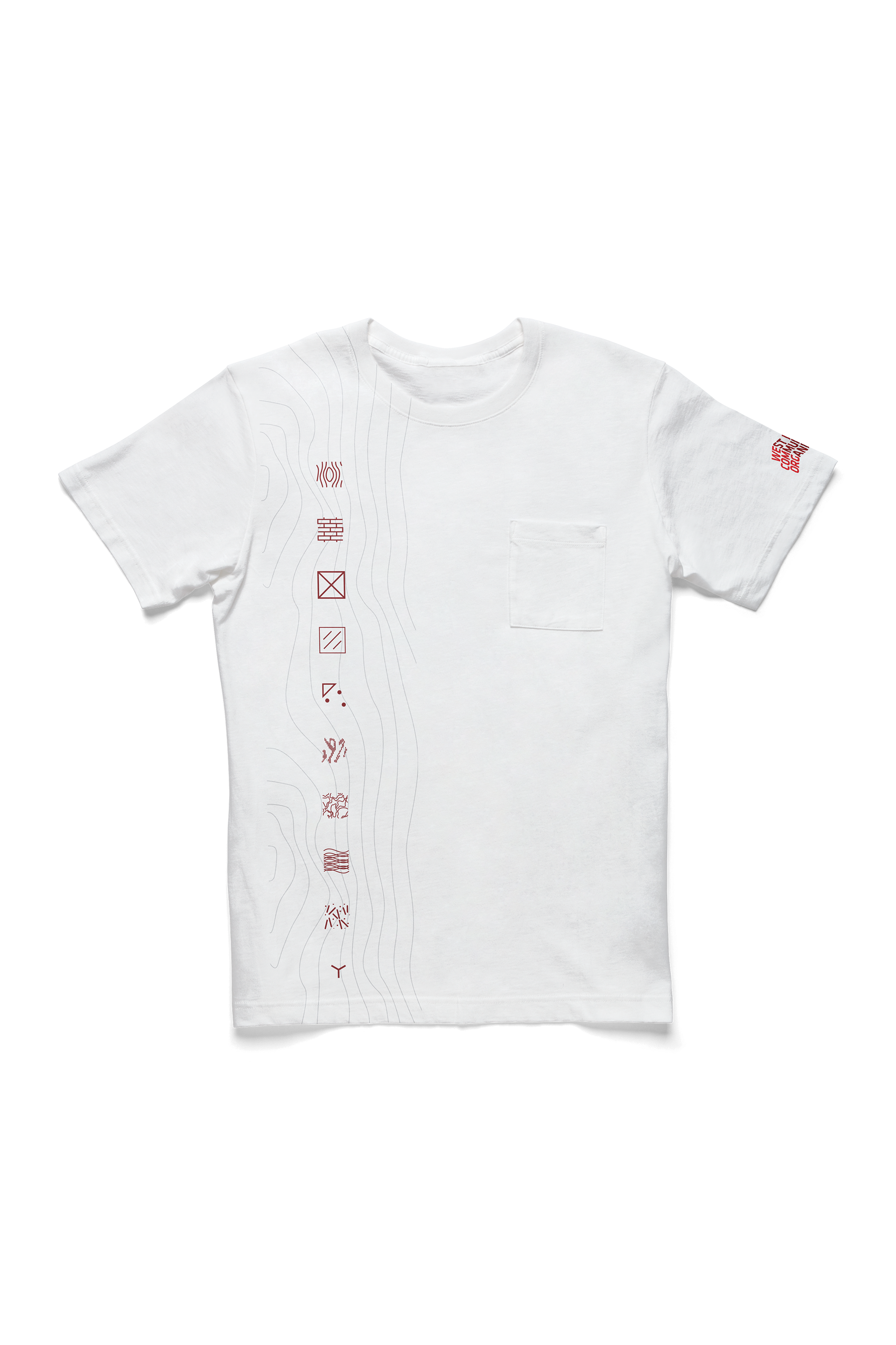
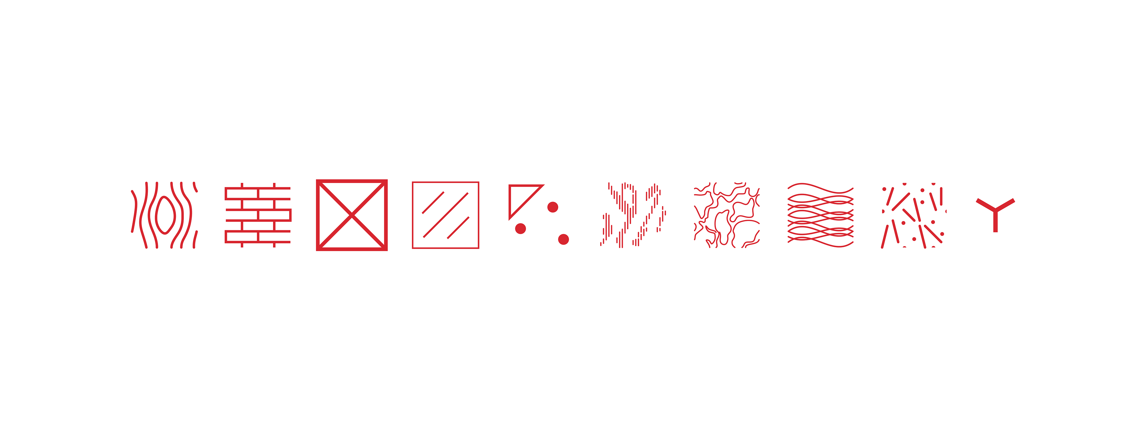
A consistent thread—conceptually and literally—throughout the combined research efforts of myself and Intradesign was the importance of material. The West Loop’s history as a manufacturing center and meatpacking district and a survey of architectural significance catalyzed an idea that the identity system needed to reflect the materiality of the neighborhood. The ten most important materials in the developmental history of the West Loop were identified. Inspired by hatching patterns in architectural construction drawings, each material was distilled into abstracted material typologies that could then be used to construct the visual language of the new identity system. Technically considered for application, these typologies can be icons that stand alone or in small clusters, or fills that paint any specified canvas.


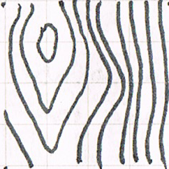
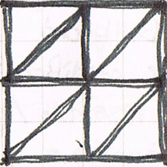
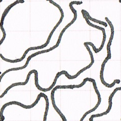
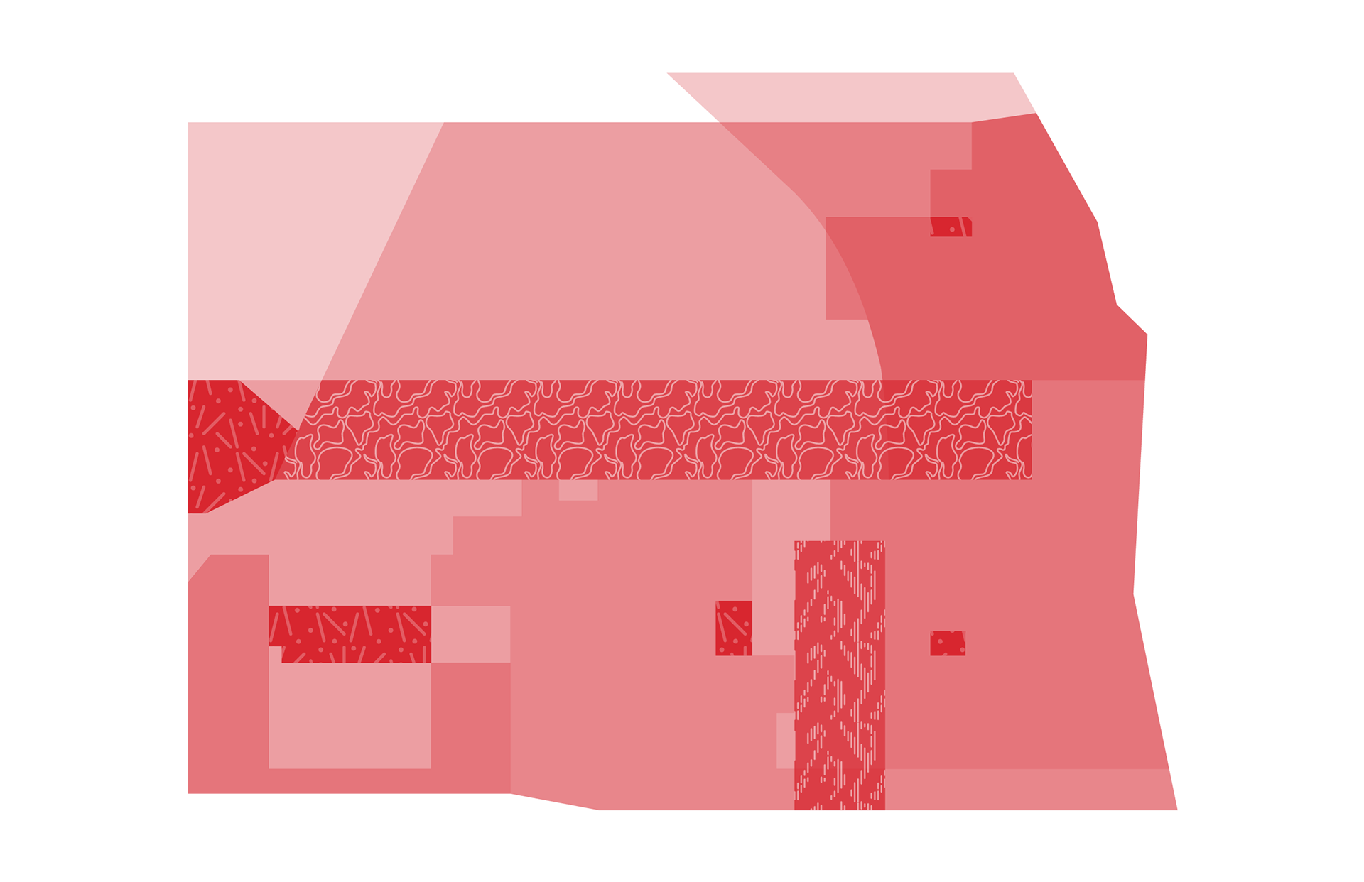
Additionally, the West Loop’s perceived identity as an aggregation of micro-neighborhoods that contribute to an overall collective socio-geographical distinction was important to highlight. Embracing this diversity and multiplicity, twelve key co-existing areas within the West Loop were identified and include demarcated wards, parks, communities, and neighborhoods. Applying the same methodology as with the materiality, these shapes were reduced to simple lines and shapes to become a secondary typological system.

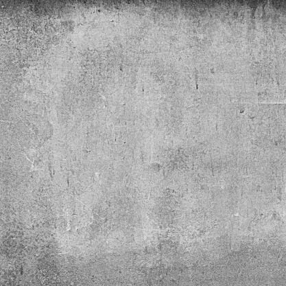
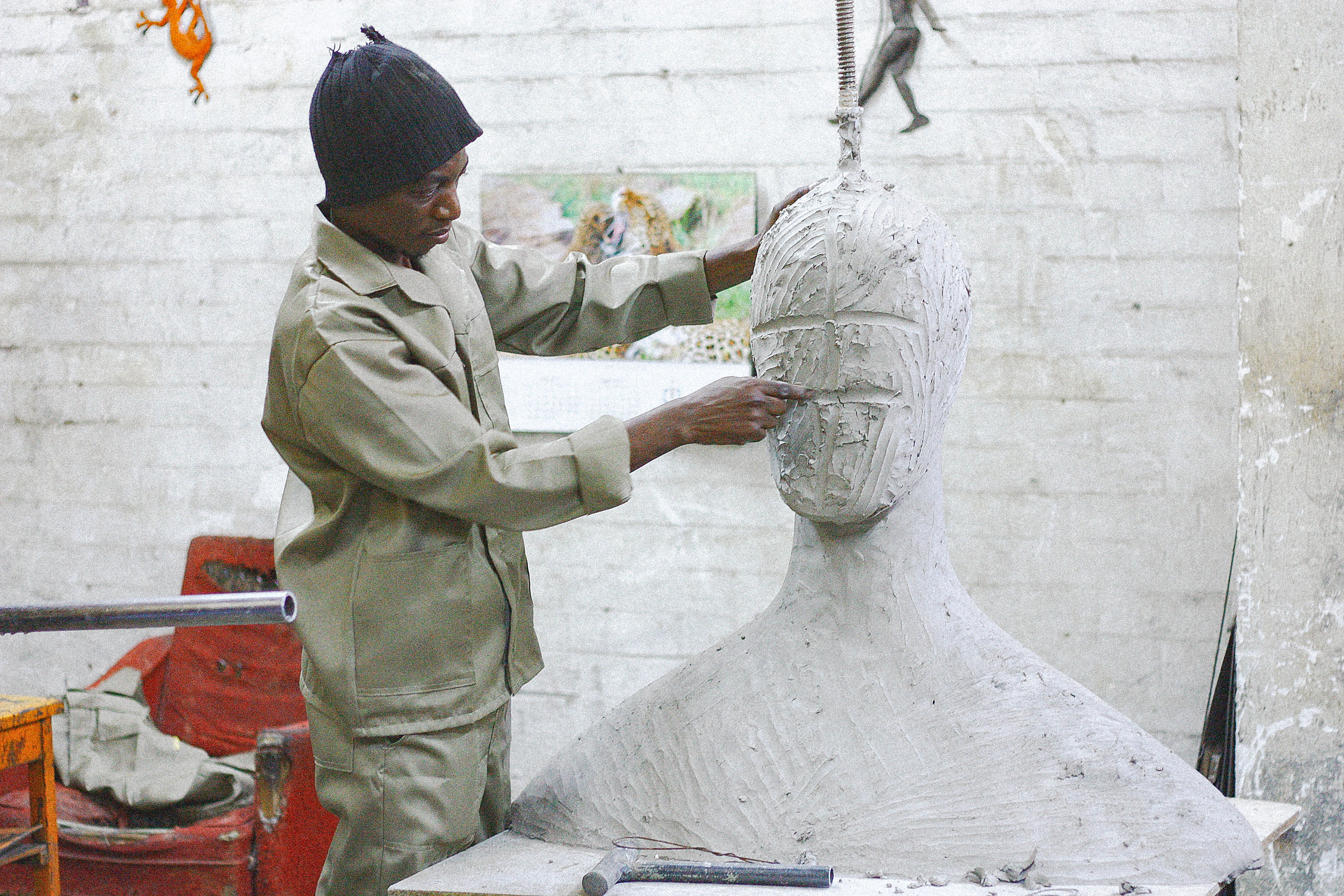
Considering the importance of photography, we pair the abstraction of the information system with realistic images of people and places. Deriving from an analysis of the artifactual survey in the research, effects and visuals were isolated particular to photography from the West Loop’s history, including authentic color, prevalence of photo-grain, and low-contrast shadow levels. The treatment of images celebrates the makers, the creatives who live and/or work in the West Loop and brings forth the grit, texture, and character of the neighborhood’s history.


This project was a collaborative effort with Sevy Perez under contract with Intradesign.
Supplemental images pertaining to the project process or final presentation licensed through Adobe Stock, including but not limited to: photographs of individuals or the likenesses of individuals and additional photography. The Klavika and Caecelia typeface families were licensed for commercial use through Intradesign.
All other images, original design elements, and combinations of elements constituting an original design are owned by Intradesign and West Loop Community Organization.